Lowe’s

Lowe’s

Lowe’s

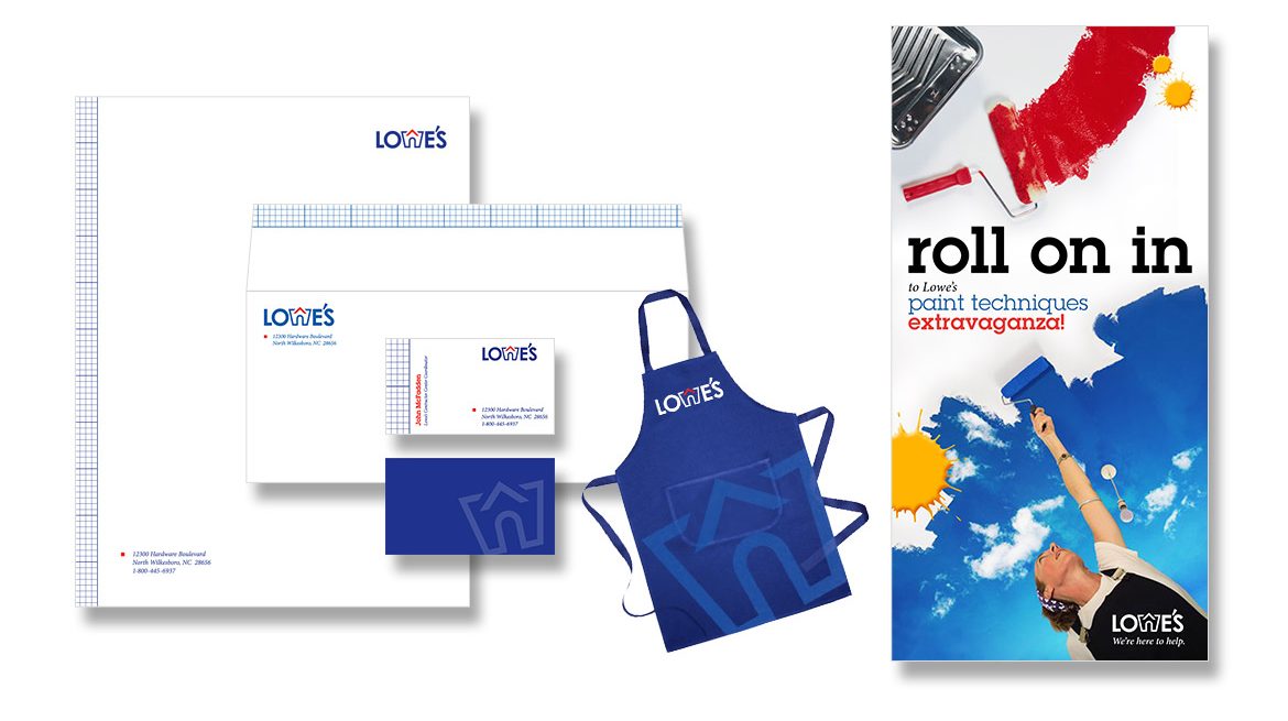
Student project, SCAD. Task: choose an existing brand and give it new life. Have you ever really looked at the Lowe’s logo? Could you describe it? I’d bet not (sorry, Lowe’s, but s’truth). Why not modernize and give Home Depot a run for their money? The new brand mark is simple and elegant, but still playful. Your house is your castle, right? At this Lowe’s, you’d get the royal treatment, but leave with a jester’s smile.

Equus

Equus

Equus

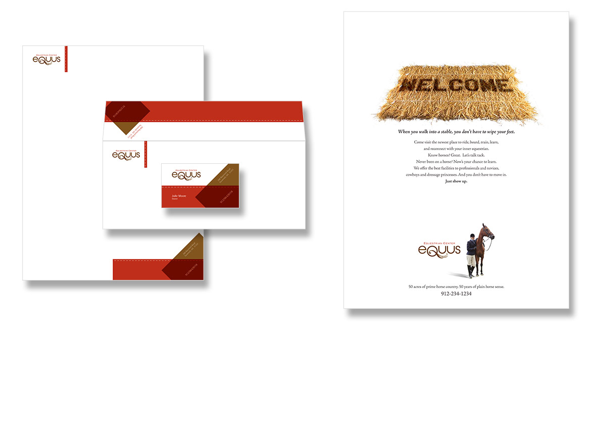
Student project, SCAD. This logo was actually a by-product, an unexpected brainchild that arrived following a research trip taken to get fodder for a copy writing project. We needed to write an ad for an equestrian-focused living community, and after an inspiring trip to the stables, this logo became the cherry on top of this writing project. The ad was the catalyst for an experimental brand. Business papers followed, and the ad set a welcoming tone for both the home buyer and the visitor at these equestrian facilities.

Career Woman

Career Woman

Career Woman

The brand for Career Woman, Inc. needed to be professional with a feminine touch. The lockup of C and W forms a mark that is solid yet light, and is evocative of both a plant coming into bloom, and the feminine symbol of Venus. Career Woman, Inc. is a woman-owned Seattle company dedicated to the advancement of women in business, so I’m especially proud to have played a key roll in creating this company’s face.