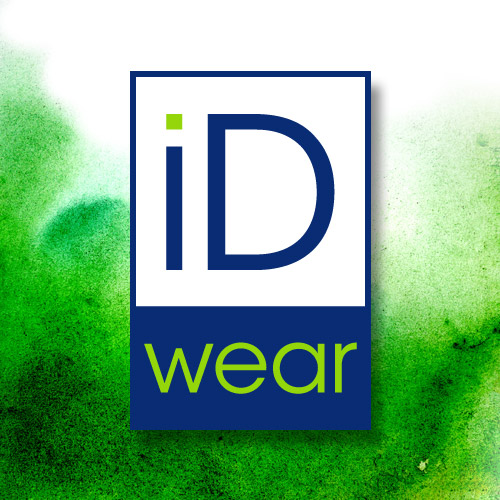
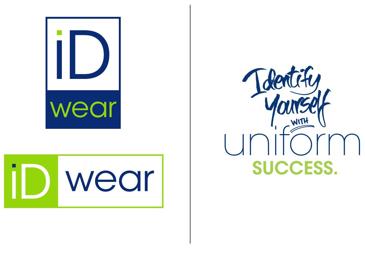
iDwear Branding

iDwear Branding

iDwear Branding

iDwear is a uniform apparel company born in 2014, and we built the brand from the ground up. The logo mark is reminiscent of an ID tag, which speaks to the idea of identity, and the contrasting color of the dot on the “i” reinforces this concept. The metaphor that one can remain an individual even when wearing a uniform begins here and steers the entire brand’s messaging. The tagline spells it out – this example also introduces the hand-rendered element of the brand.

Vectra Holdings

Vectra Holdings

Vectra Holdings

This parent company has several related brands under its corporate umbrella, so we needed to create a mark that reflected those connections visually. We kept the color palette quiet and neutral to convey dependability and trustworthiness, and used clean, minimalist typography to convey innovation and expertise.

Big Blue Yachtwear

Big Blue Yachtwear

Big Blue Yachtwear
Brand Refresh

We took this logo forward a decade and added more options for different uses while we were at it. Moving away from the red, white, and blue instantly injected a modern vibe, and changing up the blue hues made the logo feel fresh again.

New World IQ

New World IQ

New World IQ

When NewWorld Commerce and IQ Commerce merged, they needed a brand that would enfold both companies, giving equal emphasis to both in one mark. The letterforms reach forward towards future growth and innovation, leading the eye to the core idea of a strong, personal investment in the client.

Manteia

Manteia

Manteia

As a biotech company dedicated to DNA research, Manteia was looking for a brand mark representing encapsulation of the whole body’s map. These two arcs swirl together to form one unit: what is, and what can be.